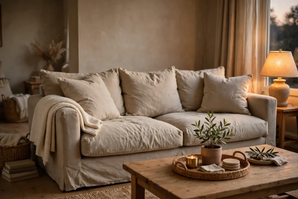
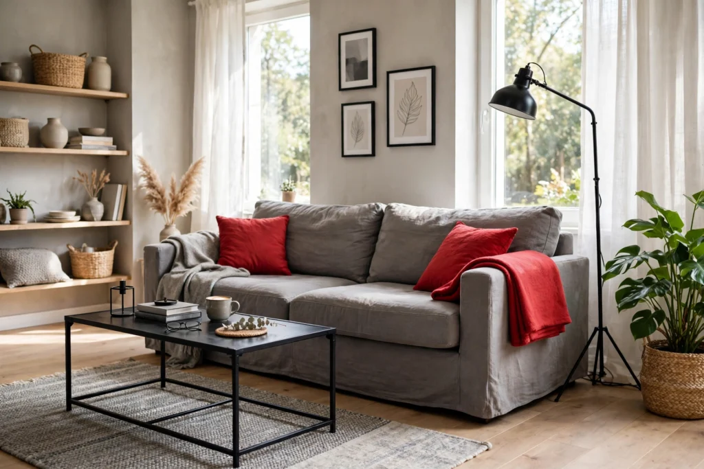
You can make gray black and red feel calm and stylish if you let gray lead. Then black adds shape, and red stays small. Use the 60-30-10 split, pick warm gray tones, and repeat red in just a few spots. In short, the room will feel bold, not loud.
Gray, Black and Red: The 60-30-10 Balance
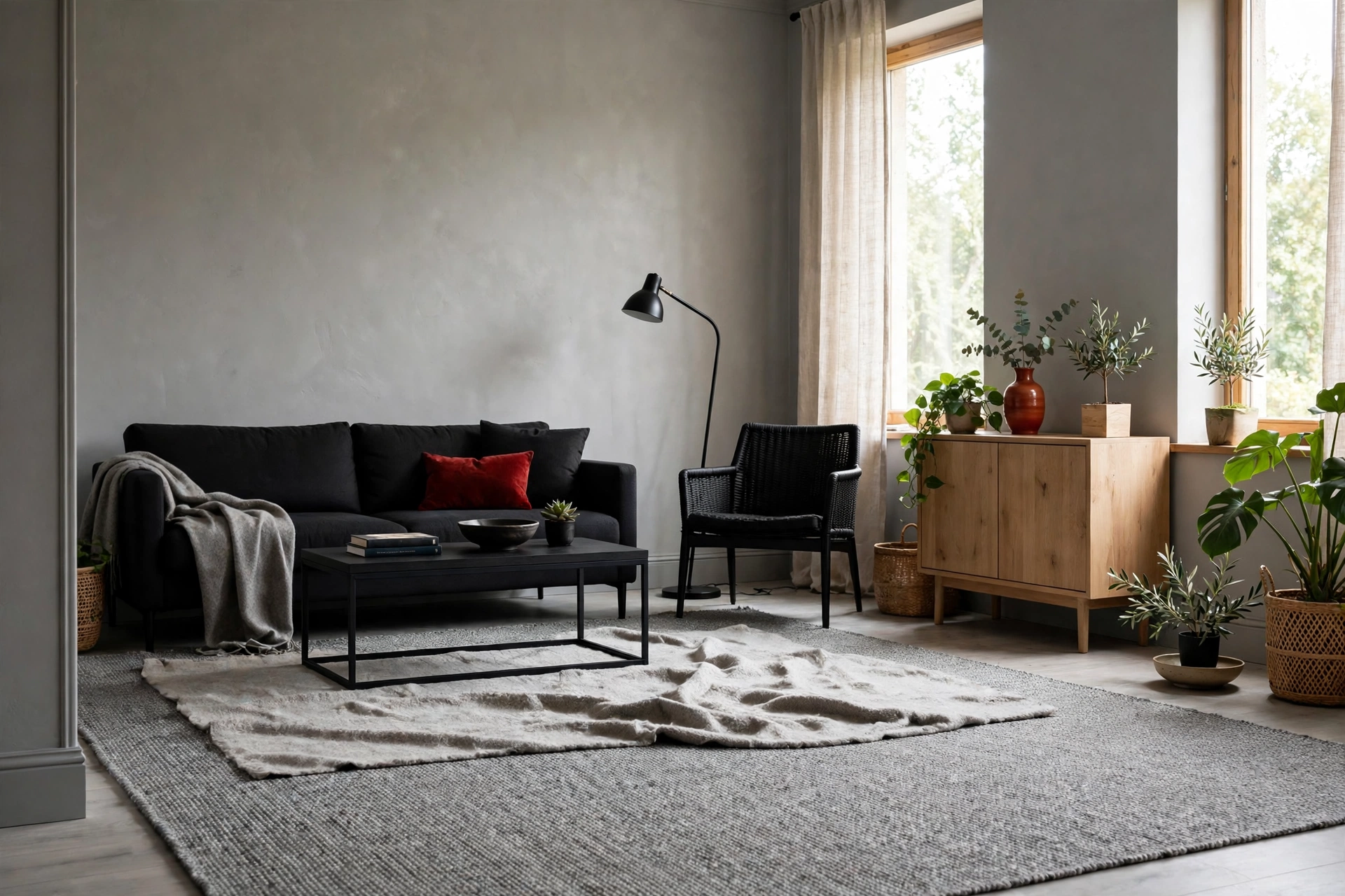
This scheme works when each color has a clear job. First, gray does the most work and sets the calm base. Black adds shape and contrast in smaller doses. Red brings energy, but only as a small accent.
So the 60-30-10 rule gives you a simple split to follow. About 60 percent of the room is the main color, here gray. About 30 percent is the second color, here black. The last 10 percent is the accent, here red.
Think of it in real items, not paint charts. For example, gray covers walls, the rug, and the largest furniture. Black shows up on a coffee table, lamp bases, frames, and side tables. Red appears on cushions, a throw, and one piece of art.
You do not need to measure. Just ask which color your eye sees first, second, and last. If red hits first from every corner, it is no longer an accent.
Indeed, paint brands teach this same split as a starting point for balanced rooms. The Benjamin Moore guide to the 60-30-10 rule explains how the shares work together.
Texture helps, too. A nubby gray rug, a smooth black table, and a woven red throw also read differently. So the room gains depth.
How to Check Your Balance in Five Minutes
- Stand in the doorway and squint at the room.
- Name the color you see most. It should be gray.
- Name the next color. It should be black.
- Count the red items. Three to five is plenty.
- Move or cover one red item if the count feels high.
Living Room: Gray Base, Black Lines, Red Accents

Start with the big pieces in gray. For example, a gray sofa, light gray walls, and a mid gray rug calm the room at once. They give black and red a quiet place to stand out.
Next, add black as clean lines. A black coffee table, thin black floor lamp, and black picture frames work well. Black legs on chairs and a black side table repeat the line without filling the room. Keep black pieces slim where you can.
Layout helps the colors land well, too. Good living room layout ideas put the rug and sofa first, then layer color on top.
Now place red in a loose triangle. Put two red cushions on the sofa and a red throw on a chair. Then add a small red vase on a shelf. Your eye then moves from spot to spot and reads the color as planned, not random.
Keep red off the largest surfaces here. A red sofa or a full red wall breaks the balance in most living rooms. Small red pieces give the same energy, and you can then swap them out in minutes.
A Simple Living Room Mix to Copy
- Walls and rug: light to mid warm gray
- Sofa: mid gray fabric with plain weave
- Black: coffee table, lamp, frames, side table
- Red: two cushions, one throw, one small vase
- Warmth: light wood tray and one green plant
Bedroom: A Calmer Take on the Scheme

A bedroom needs the same three colors in softer shares. Keep gray near 70 percent here if sleep is the goal. Let black drop to about 20 percent, and keep red near 10 percent in a deeper tone.
Use gray on walls, bedding base, and curtains. A light gray duvet cover with a darker gray throw gives you layers without strong contrast. The bed stays the calm center of the room, which is what you want at night.
Black should stay thin and low in a bedroom. A black bed frame, two black bedside lamps, or a black bench at the foot of the bed is enough. Avoid black on all four walls, as that can feel heavy.
Red needs care before bed. Bright red near your pillow can feel loud when lights go low. Put deeper red on a cushion, a folded throw at the foot of the bed, or a small rug. Brick and burgundy tones feel calmer than fire truck red.
If you want a restful base first, try our guide to calming bedroom color ideas. It also shows soft shades that pair well with gray.
Warm light matters more in a bedroom than anywhere else. Pick warm bulbs and soft lamp shades. Warm light softens black edges and makes deep red look rich, while cool light can make gray look blue.
Kitchen and Dining: Small Doses That Work
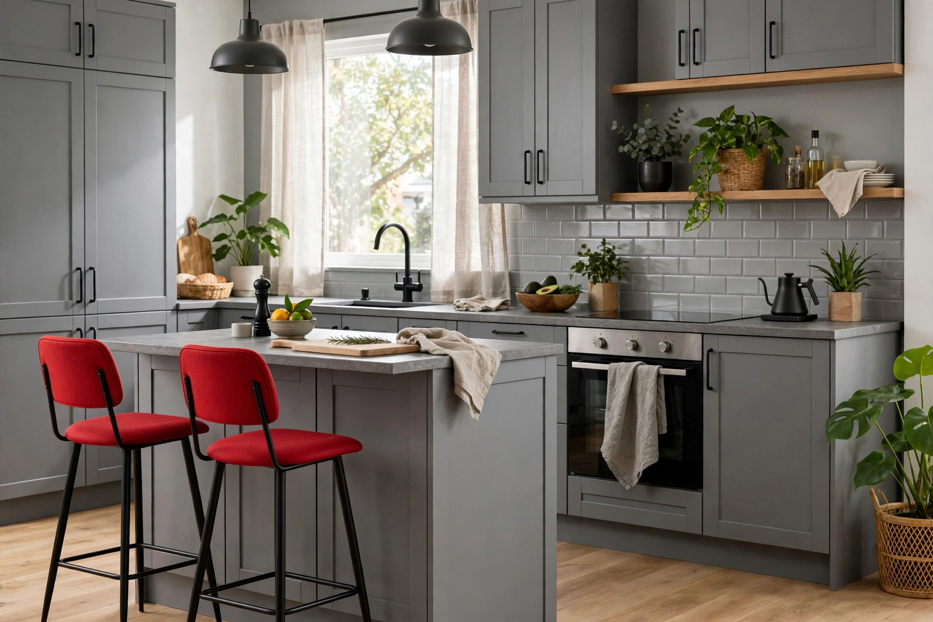
Kitchens have a lot of hard, shiny surfaces, so this scheme needs a lighter hand here. Gray can lead on cabinets or walls. Black can outline with handles and lights. Red should stay small and easy to swap.
Gray cabinets are a strong, safe base. They also hide marks better than white and feel softer than black. Pair them with a pale gray or warm white wall so the room stays bright.
Black works best as hardware and lines. Try black cabinet handles, a black faucet, and black pendant lights over an island. Those thin lines look sharp against gray and do not darken the room.
Red earns its place in items you touch each day. Red bar stools, a red kettle, red seat pads, or a red fruit bowl all work. In a dining area, try red napkins and a red centerpiece bowl. Then try two red chairs at the ends of the table.
Safe Places for Red in a Kitchen
- Bar stools or dining chair seats
- Kettle, toaster, or stand mixer
- Tea towels, napkins, and seat pads
- Fruit bowl, vases, and small art
- One pendant shade or a short runner rug
Keep red away from large fixed parts unless you love it. Red cabinets or a red backsplash are hard to change. Small red items give you the look with an easy exit, so test the scheme first.
Which Shade of Red (and Gray) Should You Pick?
Not all grays and reds behave the same way. Undertone is the hidden color that shows in real light. A warm gray has a beige or soft brown base. A cool gray has a blue or violet base. Warm gray almost always works better with red.
Red has undertones, too. Warm reds lean orange or brick and feel cozy. Cool reds lean blue or berry and feel sharp. With warm gray and true black, a warm or deep red tends to blend best. Bright cool red can jump out and feel harsh.
Test shades in your own light before you buy. North light makes gray look cooler and bluer, while south light warms it up. Then paint a large swatch and check it at night under your lamps.
Proven Paint Shades to Try First
For a proven warm gray, look at Agreeable Gray SW 7029 by Sherwin-Williams. In fact, it is a light gray with a soft beige undertone. Another warm pick is Revere Pewter HC-172 by Benjamin Moore. You can read its tone and light value on the Benjamin Moore Revere Pewter color page before you sample it.
For black, a true neutral black keeps things clean. Tricorn Black SW 6258 by Sherwin-Williams has almost no visible undertone, so it pairs well with most grays and reds.
Shade guide: warm grays, true black, and reds that balance well
| Shade | Undertone | Best use |
|---|---|---|
Agreeable Gray SW 7029 |
Warm beige | Walls, large areas |
Revere Pewter HC-172 |
Warm greige | Walls, cabinets |
Repose Gray SW 7015 |
Warm taupe | Walls, bedding base |
Tricorn Black SW 6258 |
Neutral, true black | Furniture, frames |
Show Stopper SW 7588 |
Deep, warm red | Accents, one chair |
Positive Red SW 6871 |
Bright, warm red | Small accents only |
Start with the gray, then match the red to it. If your gray is warm and soft, then pick Show Stopper for a deep, calm red accent. If you love bright red, use Positive Red only on tiny items, like a vase or two cushion covers.
A Worked Example: One Living Room, Three Colours
Here is one full room built step by step. It is a small rental living room with white walls you cannot paint. It has one sofa, one rug, a TV stand, and a reading chair.
Step one, set the gray base, about 60 percent. The sofa is a mid gray fabric sofa you already own. Add a light gray rug under the front legs and pale gray curtains at the window.
Step two, add black lines, about 30 percent. Swap in a slim black metal coffee table and a black TV stand. Add a tall black floor lamp in the corner and three black frames above the sofa.
Step three, place red accents, about 10 percent. Put two deep red cushions on the gray sofa. Fold a red throw over the reading chair. Set a small red vase on the coffee table and pick art with one thin red line.
The Room at a Glance
- Gray 60 percent: sofa, rug, curtains, knit throw
- Black 30 percent: coffee table, TV stand, lamp, frames
- Red 10 percent: two cushions, one throw, one vase
- Warmth fix: wood, plants, and warm light, below
Step four, add the warmth fix, as this scheme can feel cold on its own. Put a light wood tray on the coffee table and a wood side stool next to the chair. Those warm tones soften both gray and black.
Then add green and warm light. One leafy plant by the window also breaks up the three colors with life. Swap cool bulbs for warm bulbs in the floor lamp. The red looks richer, the gray softer, and the black edges lose their hard edge.
The result feels bold but easy to live with. You see gray first, black second, and red as a clear accent. If you tire of red, swap the cushions, throw, and vase in one hour. The base stays.
Mistakes That Make This Scheme Look Harsh
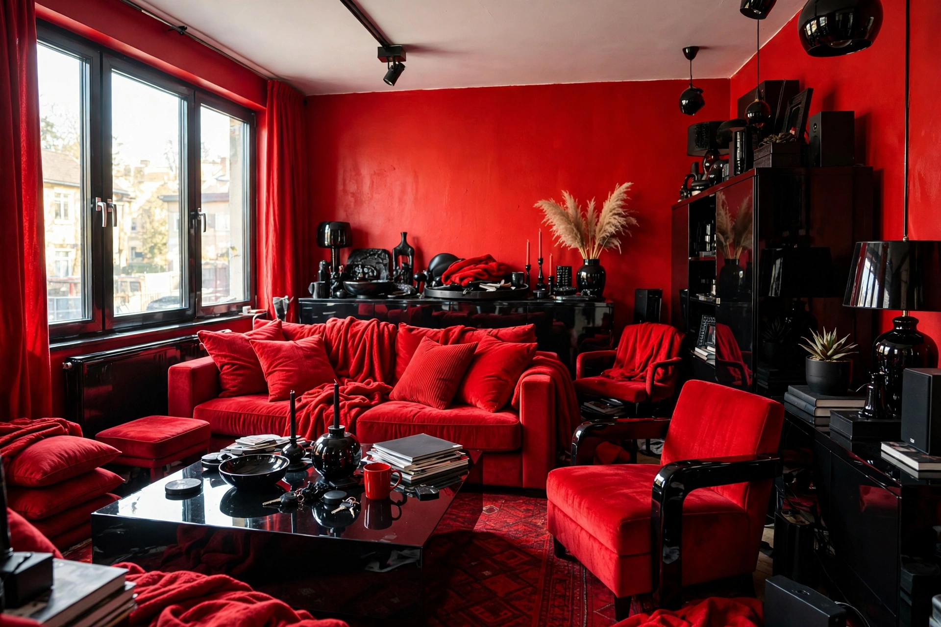
Most harsh rooms share the same few errors. The colors are not the problem on their own. Instead, the shares, shades, and light around them cause the trouble. Fix the share first before you buy anything new.
- Using red on walls, sofa, and rug at the same time
- Picking a cool blue gray with a bright orange red
- Adding thick black furniture on every side of the room
- Using cool white bulbs that turn gray blue and red sharp
- Skipping wood, plants, and soft fabric, so all surfaces feel hard
- Mixing four or five red shades that do not match
- Putting red and black in equal shares with no gray rest space
Equal shares are the fastest way to lose balance. A room that is half black and half red has no calm base. Your eye has nowhere to rest, so the room feels tense. Push gray back to the lead and the same pieces calm down.
Shade clashes cause the next most harm. A cool gray wall can make a warm brick red look dirty. Hold fabric and paint swatches side by side in daylight before you commit.
Light can undo good choices, too. One harsh ceiling bulb makes black look flat and red look cheap. Add a lamp at seat height with a warm bulb. Soft side light shows texture and takes off the hard edge.
If your room already feels harsh, remove items first. Take out half the red pieces for one week. Then add one back at a time until the room feels alive again.
Frequently Asked Questions
Is this scheme too bold for a small room?
No, it can work well in a small room if gray stays light and leads the scheme. Use light gray on walls and the rug, keep black pieces slim, and then limit red to three small items. That balance gives you contrast and energy without closing the room in or making it feel dark and busy.
Which red works best with gray and black?
Deep, warm reds work best for most homes because they sit well with warm gray and true black. Brick, burgundy, and deep muted red feel calm and rich in normal light. Bright red can also work well. However, keep it to tiny accents like a vase, book, or one cushion, so it does not take over.
Can I paint one wall black in this scheme?
Yes, one black wall can work if the rest of the room stays light gray and calm. Put the black wall behind a sofa or bed, keep red accents small, and add warm light and wood nearby. Test the black on a large swatch first, as it will make the room feel smaller and darker at night.
What softens a gray, black, and red room?
Wood, plants, and warm light soften this scheme the fastest. Light or mid wood adds warmth between the cool gray and hard black. Green plants break up the three colors with a natural tone. Warm bulbs and soft fabrics like knit throws and linen cushions take away the sharp, cold edge at once.
Should my gray be warm or cool with red?
Warm gray is the safer pick with red in most rooms. Its beige base stops red from feeling harsh and keeps black from looking too stark. Cool gray can look sharp and modern, but it needs care with light and red shade. Always test your gray swatch next to your red fabric in daylight.
How much red is too much in one room?
Red is too much when your eye lands on it first in every corner of the room. As a guide, keep red near 10 percent, or about three to five small items in a normal room. If you have a red rug, red walls, or a red sofa, remove the other red pieces to restore balance.
Conclusion
Gray, black, and red can look calm, warm, and planned. So let gray lead, let black draw clean lines, and keep red small and deep. Pick warm shades, test them in your own light, and add wood and plants for softness.
Start small this week and test the look before you spend much. A few simple decor touches that change a room also help. For example, two red cushions and a black lamp show you the balance fast. Live with them for a few days, then adjust the shares until the room feels right.