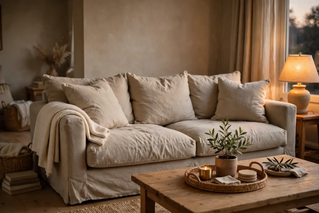
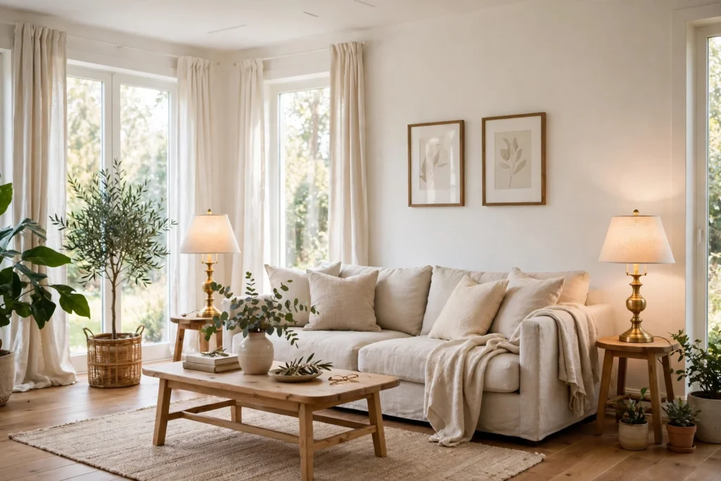
Benjamin moore atrium white paint is a gentle off white that feels fresh and soft. It reads as white at first glance, then shows a faint pink warmth on closer look. In this guide, you will learn what the color looks like, how light changes it, which rooms suit it, and how to test it before you paint.
Benjamin Moore Atrium White Paint at a Glance
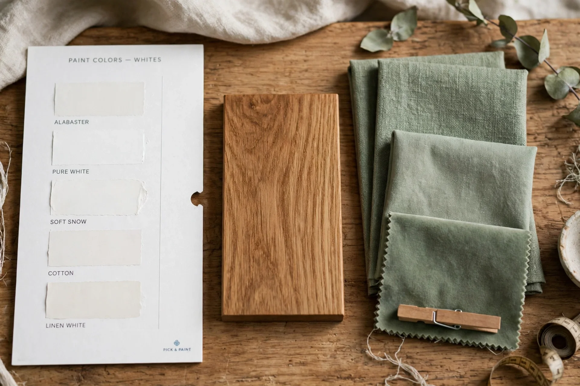
Atrium White carries the code PM-13, and it is also known as Atrium White OC-145. Benjamin Moore describes it as fresh and youthful, a gentle white with a touch of pink. It sits in the Off White collection, which groups soft whites that feel warmer than pure white. For the official color details, see the Benjamin Moore Atrium White page.
The light reflectance value, or LRV, is 87.04 on the official page. LRV runs from 0 to 100, where higher numbers reflect more light. A value of 87 means this color reflects a great deal of light, so it reads as a bright, airy white in most rooms. Note that some older listings quote a different LRV, but the official Benjamin Moore page lists 87.04, and that figure governs this guide.
In practice, the pink touch is subtle, not bold. On a large wall in daylight, the color looks like a clean soft white. In warm evening light, the pink warmth shows a little more. This shift is normal for off whites, since every white reacts to the light around it. For that reason, always test the color in your own room before you commit to gallons.
Undertones and How Light Changes Them
Undertones are the faint colors hiding inside a white. Atrium White has a pink undertone, which makes it feel warm and gentle rather than cool or stark. Pink undertones suit rooms with warm wood, brass, and soft fabrics, since those materials share the same warmth. In addition, pink undertones flatter skin tones, which is one reason soft whites suit bedrooms and living rooms.
North facing rooms get cooler, bluer daylight. In such rooms, the pink touch may read a bit stronger, since cool light contrasts with warm undertones. This can look pretty, but test it first if you dislike pink. South facing rooms get warm, yellow daylight, which softens the pink and makes the color read as a creamy white. East rooms look warm in the morning and cooler later, while west rooms warm up toward evening.
Artificial light changes the color too. Warm bulbs bring out the pink, while cool daylight bulbs make the color read whiter and crisper. If your room uses mostly warm bulbs, expect a warmer result. If you want the whitest read, pair the paint with daylight bulbs and white trim. Test the color under both daylight and evening bulbs before you decide.
Nearby colors also shift how the white looks. Next to a cool gray sofa, the pink touch may stand out more. Next to warm wood floors, it blends in and feels natural. Always test the color beside your fixed items, such as floors, countertops, and large furniture, since those items never change.
Rooms That Suit This Soft White
Living rooms suit this color well, since it keeps the space bright without feeling cold. It pairs with warm wood, linen sofas, and brass lamps for a calm, welcoming room. On all four walls, it feels airy rather than stark. For a warmer living room feel, our guide to creating a warm and cozy living room shows how soft colors, texture, and light work together.
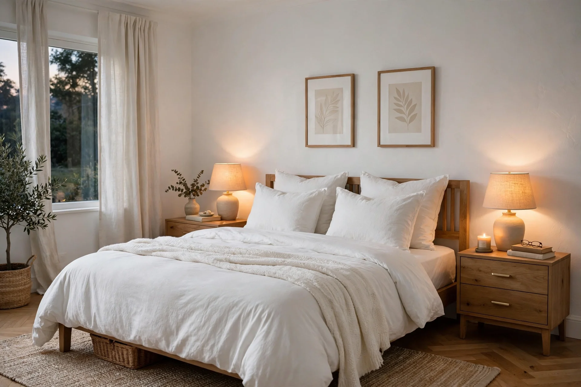
Bedrooms also suit this white, since the gentle warmth feels restful at night. It works on walls with white bedding and wood nightstands, and it softens rooms with little natural light. If you want a calm sleep space, pair it with soft neutrals and warm bulbs. For more restful bedroom shades, see our guide to calming bedroom colour ideas.
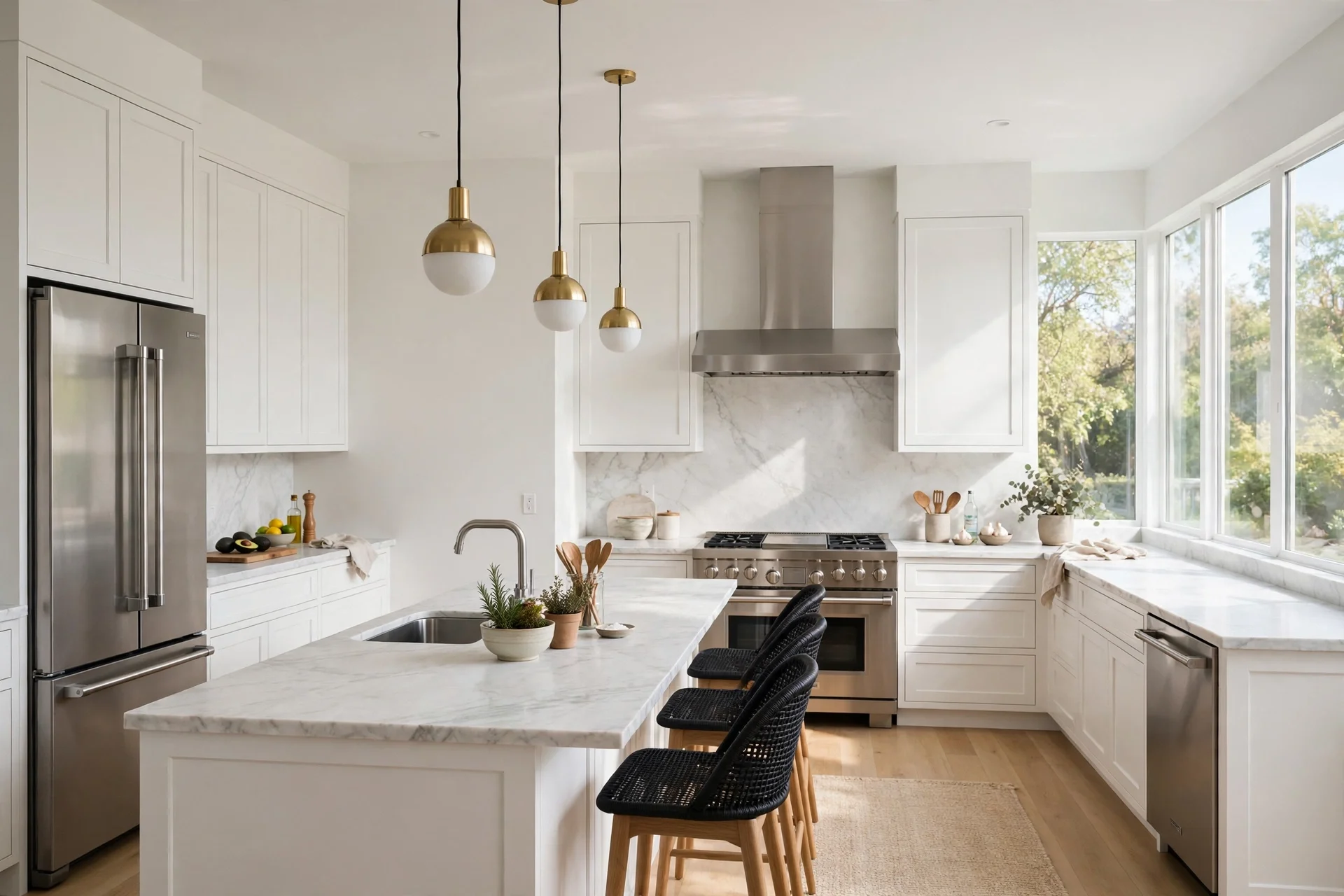
Kitchens suit this color when light is good. It brightens white cabinets and marble counters without clashing, and it warms up cool stainless steel. However, test it beside your countertop first, since busy stone patterns can clash with pink undertones. In a dark kitchen with little daylight, the color may read warmer than expected, so check it at night under your kitchen lights.
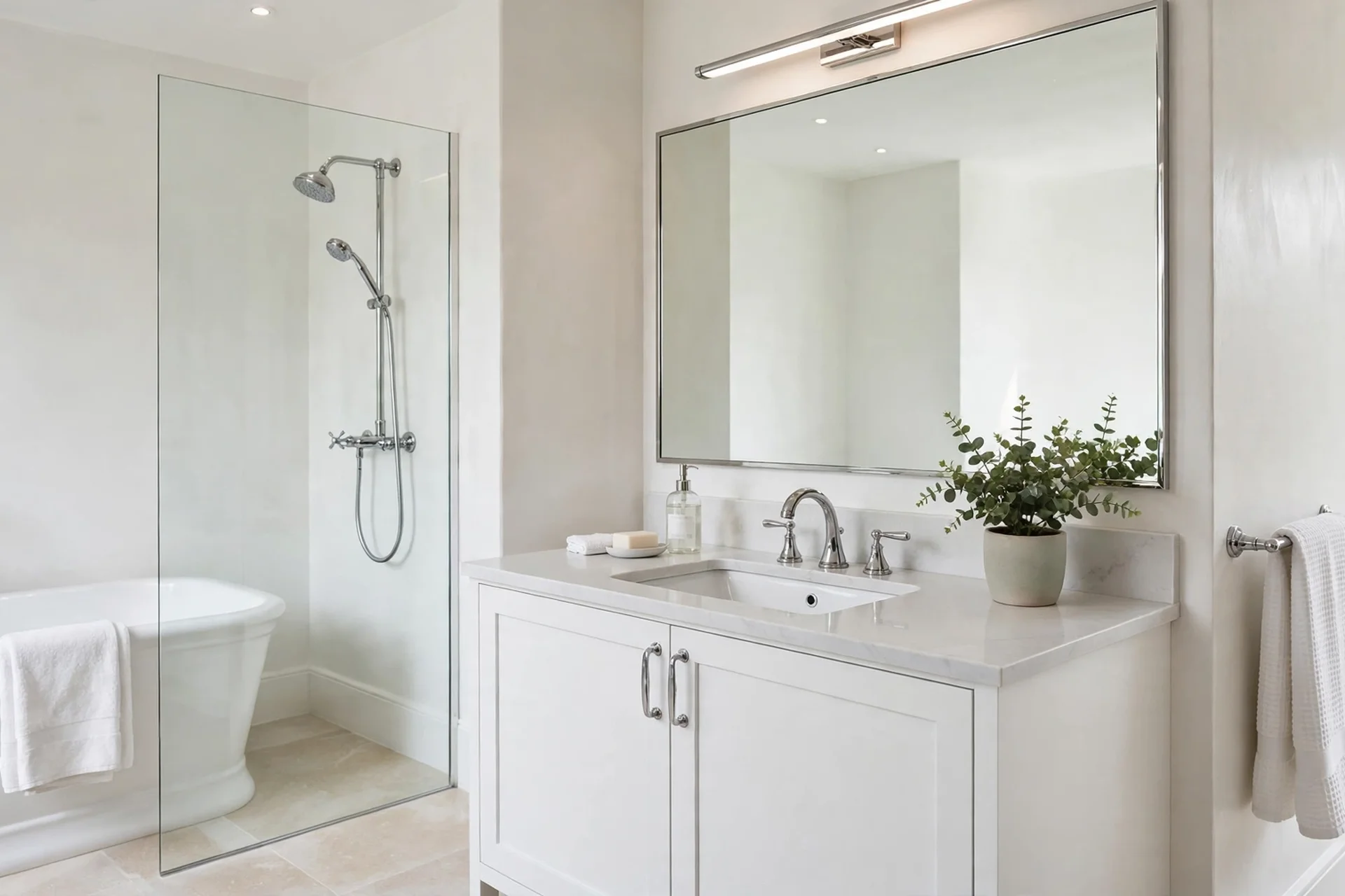
Bathrooms suit this white when the room has decent light and white fixtures. It keeps small baths feeling fresh, and it pairs well with chrome and brushed nickel. In a windowless bath, use bright daylight bulbs to keep the color crisp. Trim, doors, and ceilings also suit this color, since a soft white trim looks gentler than stark white beside warm walls.
Room Guide at a Glance
| Room | Why it works | Watch out for |
|---|---|---|
| Living room | Bright, warm, pairs with wood and brass | Pink may show beside cool gray sofas |
| Bedroom | Restful warmth, flatters soft bedding | Test under warm night bulbs |
| Kitchen | Brightens cabinets and counters | Check beside busy stone patterns |
| Bathroom | Fresh feel with white fixtures | Use daylight bulbs in windowless baths |
| Trim and doors | Softer than stark white | Match trim finish to wall finish |
Pairing Colors That Work
Warm neutrals pair most easily with this white. Think warm beige, soft taupe, greige with a warm base, and natural wood tones. These partners share the same gentle warmth, so the whole room feels calm. Use them for large furniture, rugs, and curtains, and let the white stay the quiet background.
Soft greens also pair well, since green cools the pink just enough to balance it. Sage green, soft olive, and muted eucalyptus tones all work. Try sage on an accent wall or in bedding, with Atrium White on the other walls. This mix feels fresh and natural, like a garden room.
For contrast, navy blue and charcoal add depth without fighting the pink. A navy accent wall, navy sofa pillows, or charcoal dining chairs all ground the soft white. Use dark accents in small doses, such as one wall or a few pieces, so the room stays bright. Brass, gold, and warm wood metals complete the look, since cool chrome can feel too stark beside pink undertones.
Avoid pairing this white with very cool grays or icy blues on large areas. Cool grays can make the pink touch stand out more than you want. If you love gray, choose a warm gray with a beige base instead. Similarly, avoid stark white trim if you want a seamless look, since stark white can make the pink undertone more visible by contrast.
Finishes and Where to Use Each
Finish means how shiny the paint looks after it dries. Flat and matte finishes hide wall flaws and look soft, so they suit living room and bedroom walls. They mark more easily, though, so they suit low traffic walls better than hallways or kids rooms.
Eggshell and pearl finishes add a soft glow and wipe clean more easily. They suit living areas, bedrooms, and dining rooms where walls need occasional cleaning. Their gentle sheen also bounces a little more light, which helps darker rooms feel brighter.
Satin and semi gloss finishes shine more and resist moisture and scrubbing. They suit trim, doors, kitchen walls, and bathrooms, where cleaning matters most. Semi gloss on trim beside matte walls gives a subtle contrast that looks polished. Always match the finish to the job: soft finishes for calm walls, harder finishes for trim and wet zones.
Sampling and Testing Before You Paint
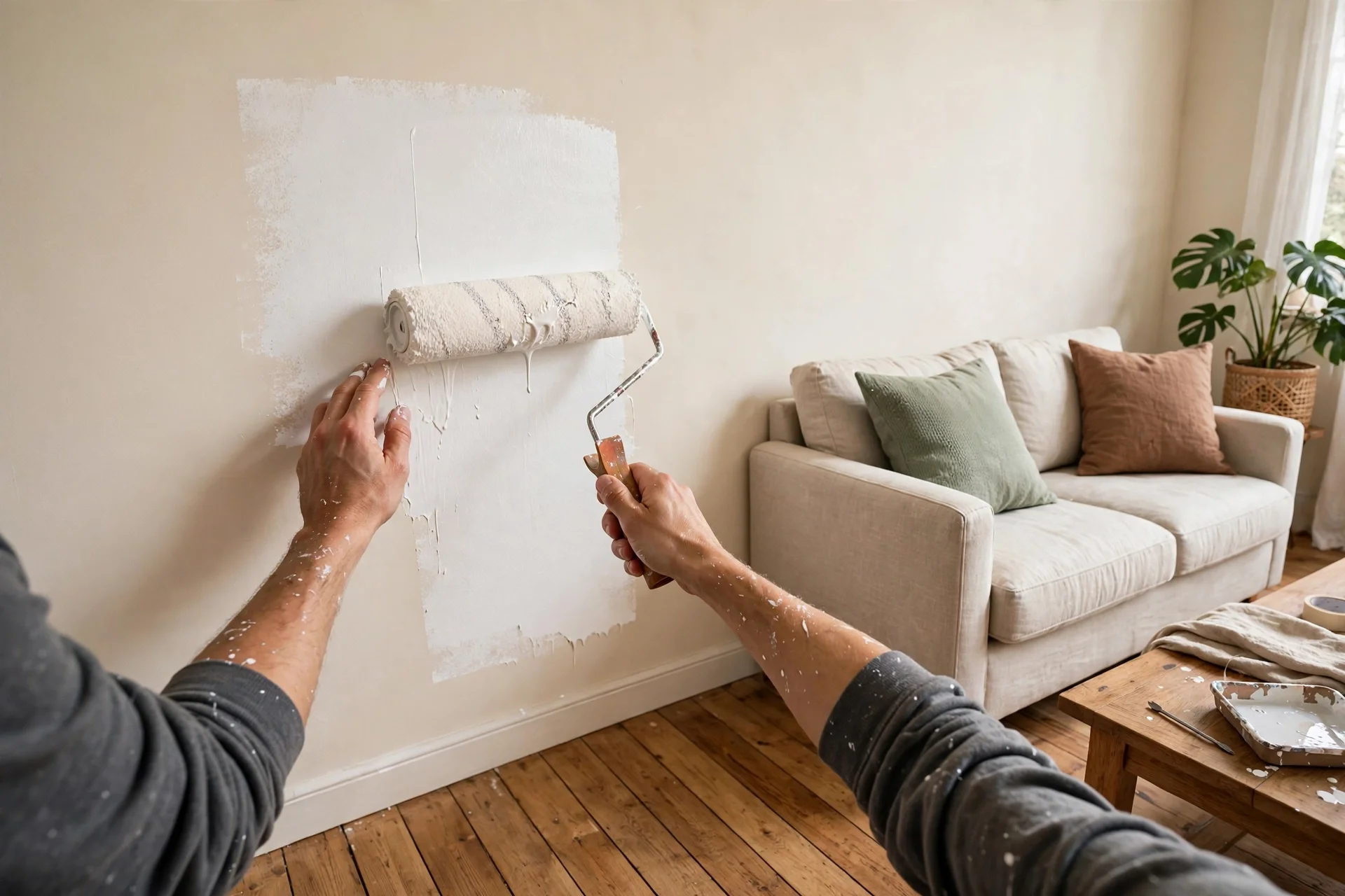
Never buy gallons from a screen alone. Benjamin Moore notes that screen colors may differ from real paint, and it offers free color chips to check the true shade. Start with a chip, then buy a small sample pot and paint a large swatch on the wall. A small chip hides undertones, while a large swatch shows them clearly.
Paint the swatch on at least two walls, since light differs by direction. Check it in the morning, at midday, and in the evening under your room bulbs. Live with the swatch for two to three days, and view it beside your floors, sofa, and curtains. This slow test prevents the most common white paint regret: a color that looked perfect in the store but shifted at home.
Sampling Checklist
| Step | What to do | Why it matters |
|---|---|---|
| 1. Get a chip | Pick up a free color chip from a paint store | Screens distort white shades |
| 2. Buy a sample | Paint a large swatch, at least 2 feet square | Small chips hide pink undertones |
| 3. Test two walls | Swatch walls facing different light | Light direction changes the read |
| 4. Check three times | View morning, midday, and evening | Bulbs and sun shift the color |
| 5. Compare fixed items | Hold the swatch beside floors and counters | Fixed items never change |
| 6. Wait two days | Live with the swatch before buying gallons | First impressions mislead with whites |
If the swatch reads too pink in your room, try a cooler off white from the same collection before you give up on soft whites. If it reads too stark, try a warmer off white instead. Paint stores can also mix a half strength version, but test that mix as its own swatch, since it behaves like a new color.
Common Mistakes With Soft Whites
One mistake is painting only one coat. Soft whites need full coverage to read evenly, so follow the maker guide for coats and drying time. Thin spots show as patches, especially in bright light. A second coat evens the color and deepens the warmth slightly.
Another mistake is skipping primer on patched or dark walls. Old color shows through soft white fast, and patches shift the undertone. Prime repaired spots and dark walls first, then paint two full coats. This step costs time but saves a repaint.
A third mistake is judging the color while it is wet. Wet paint looks darker and cooler than dry paint. Wait for full drying before you judge the undertone. Similarly, judge the color after furniture returns, since bare rooms read cooler than furnished ones.
Finally, avoid painting in very humid or cold conditions, since poor drying affects the finish. Follow the paint label for temperature and humidity ranges. Good drying gives a smooth, even finish that shows the true soft white.
Frequently Asked Questions
What color code is Atrium White?
Atrium White is PM-13, also known as Atrium White OC-145, in the Benjamin Moore Off White collection. Benjamin Moore describes it as fresh and youthful, a gentle white with a touch of pink. Its official light reflectance value is 87.04.
Does Atrium White look pink on the wall?
It shows only a faint pink warmth, not a bold pink color. In daylight, it reads as a clean soft white, while warm evening light brings out the pink a little more. Test a large swatch in your room, since light direction and bulbs change how strong the warmth looks.
Which rooms suit Atrium White best?
Living rooms, bedrooms, kitchens, and bathrooms all suit this soft white when light is decent. It pairs well with warm wood, brass, and soft neutrals. In dark or north facing rooms, test it first, since cool light can make the pink warmth read stronger.
What colors pair well with Atrium White?
Warm neutrals, soft sage greens, navy blue accents, and warm wood tones all pair well. Brass and gold metals complete the look. Avoid large areas of cool gray or icy blue, since those can make the pink undertone stand out more than you want.
Which finish should I choose for walls and trim?
Use flat or matte finishes for calm living room and bedroom walls, since they hide flaws. Choose eggshell or pearl for living areas that need wiping, and satin or semi gloss for trim, doors, kitchens, and bathrooms where cleaning matters most.
How do I test Atrium White before buying gallons?
Start with a free color chip, then paint a large sample swatch on at least two walls. Check it morning, midday, and evening under your room bulbs, beside floors and furniture. Live with the swatch for two to three days before you buy gallons.
Conclusion
In short, benjamin moore atrium white paint is a bright, gentle off white with a faint pink warmth and a high light reflectance of 87.04. Test a large swatch in your own light, pair it with warm neutrals and soft greens, and choose finishes by room. With a careful test first, this soft white can keep your home bright, calm, and welcoming for years.